ARDO Brand Refresh
Art Direction • UXUI • Social Content
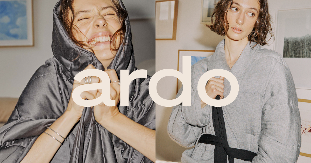
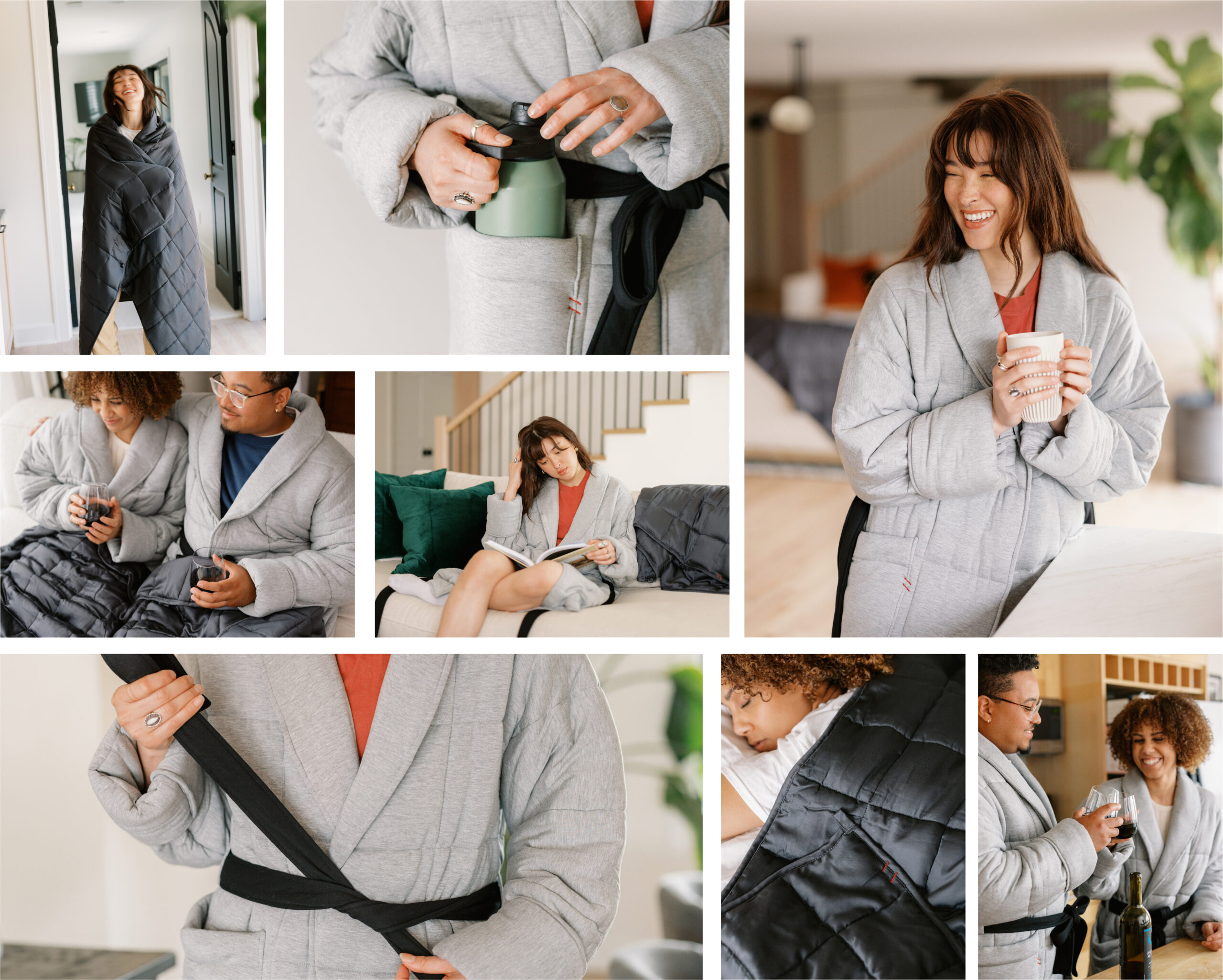
Feel your best in ardo.
Year
2021-2022
Creative Team
Rachel Ching | Art Director
Kelsea Graham | Freelance Designer
Hannah Cheung | Digital Designer
Jenny Wong | Copywriter
My Role
I led an internal and external design team to create a new branding identity for ARDO. I was also responsible for UX/UI, social media content, photoshoot direction, video + photo shooting and editing.
Goal
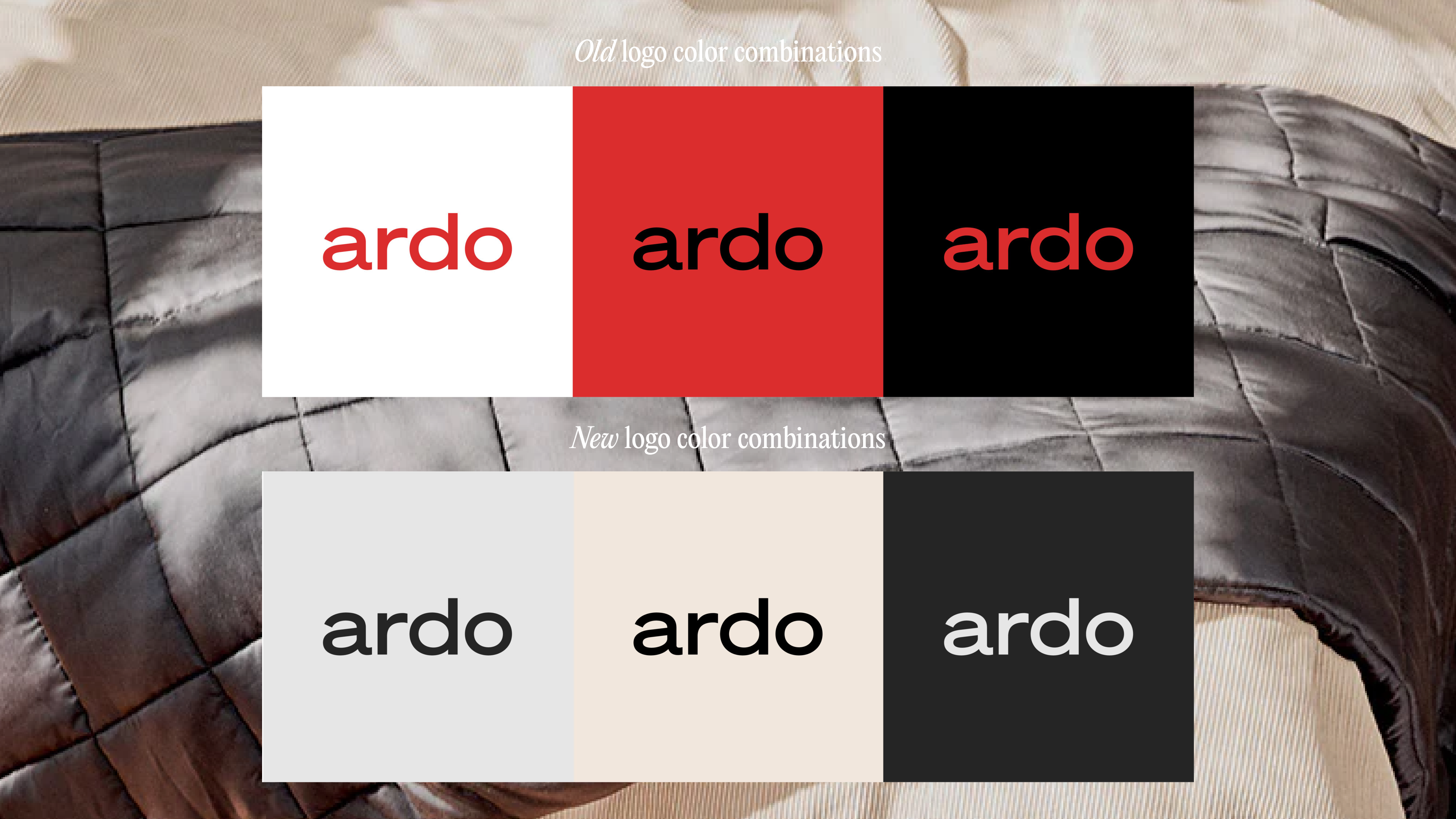
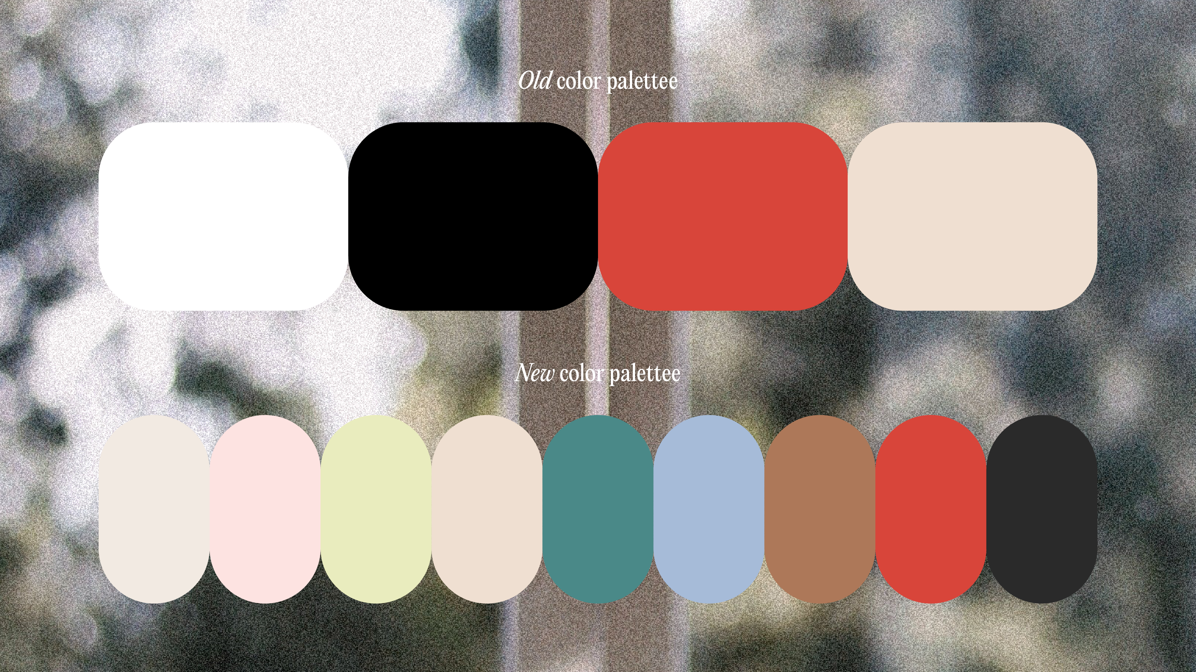
As the business is retargeting audience who focuses on self-care, sustainability and comfort, it needed a rebranding. The brand positioned itself as a cool, street-style brand at the beginning which the colors and imagery style were too edgy for the new direction.
In order to convey the message “we take care of comfort so you can take care of the rest”, the rebranding focused on introducing a new color palette and visuals on both website and social media.
© rachel ching 2023